Wednesday 28 October 2020

Nudge, nudge say no more*: Learning from behavioural changes that fail


*For those either too young to remember - or not brought up in the UK - this is from a classic Monty Python Sketch

The COVID-19 crisis has revealed the increasingly major role played by behavioural scientists in advising Governments - and major organizations - to ensure that the public adheres to their desired strategies. For  COVID-19 this includes strategies such as social distancing and mask wearing. In the last 15 years the most pervasive technique promoted by behavioural scientists is the nudge technique described in the 2008 book by Thaler and Sunstein, and which was enthusiastically adopted by national leaders such as US President Obama and UK Prime Minister Cameron.  Nudge is actually a collection of approaches sharing certain characteristics - most notably changing behaviour without much leverage - that are designed to alter choices to achieve behaviour change.

The success of a nudge is gauged by the predicted outcome and there have been many reports and research articles describing nudges deemed to have been successful. However, behavioural interventions often fail to achieve their desired aims because of "backfiring effects".  For example, many educational campaigns aim to change dietary choices by highlighting negative consequences of eating unhealthy food; but, in practice, this does not always pan out as planned because people who are dieting may be more - not less - likely to feel the need to eat a particular unhealthy food after receiving a message highlighting its negative aspects.

In contrast to the many published success stories, there has been very little research in examining interventions that inadvertently fail. A paper published today (by researchers from Queen Mary University of London, Kings College, University of Erfurt Germany, and Max Planck Institute Germany) in Trends in Cognitive Science finally addresses this problem. Lead author Magda Osman says:

Our paper provides a comprehensive analysis of behavioural iterventions that have failed and we identify the underlying causal pathways that characterise different types of failure. We show how a taxonomy of causal interactions that result in failures exposes new insights that can advance theory and practice. 

Full paper: Osman, M., McLachlan, S., Fenton, N. E., Neil, M., Löfstedt, R., & Meder, B. (2020). "Learning from behavioural changes that fail". Trends in Cognitive Science,  https://doi.org/10.1016/j.tics.2020.09.009   The full paper is available for free for 50 days. Accepted version (full pdf) is available here

UPDATE: The New Scientist has a feature on the article with an interview with Magda Osman

UPDATE: The Human Risk Podcast interview with Magda Osman about the article


Sunday 25 October 2020

Time to demand the evidence to support continued COVID19 lockdowns and restrictions

 29 Oct 2020 Update

Here is a new plot:


As I usual I am using only the data from coronavirus.data.gov.uk. The above plot shows the number of UK COVID19 deaths per 1000 cases with a 28-day delay (the reason for the delay is because of the delay between confirmed cases and death). 

The 28-day delay simply means we divide the number of deaths reported on day N by the number of cases reported on day N minus 28. It does NOT mean we are tracking whether the new cases died 28 days later.

Obviously, as I have explained in previous articles on this blog, there is a causal explanation for the higher numbers in May: 28 days prior to that it was mainly hospitalized people being tested and recorded as 'cases'.  And there are lots of other causal explanations to consider, along with the general weakness of the data provided as was explained here. Moreover, as Clare Craig has shown COVID19 deaths are clearly being over-counted.

But, increasingly, it is clear that the continued response to the virus is not in proportion to its deadliness. It is time for the Government and SAGE to provide real evidence to support the continued lockdowns and infringements of civil liberties and they can start by putting some numbers on the factors here:


A full analysis should also factor in the personal costs/risks of those people advising and making the lockdown decisions. They are - without exception - those whose own jobs are not threatened as a consequence of their decisions to lockdown and (interestingly) those least likely to be denied or delayed treatment for non-COVID medical conditions.

And note the chart does not include the many billions of pounds already spent or committed on (highly questionable) research, equipment and apps dedicated to 'combatting COVID19'. Just as there was no cost-benefit analysis for lockdown there has been no cost-benefit analysis for most of that spending, which also comes at the expense of research and equipment needed for other more serious medical conditions that will be with us for much longer.

See also


Sunday 11 October 2020

Why we know so little about COVID-19 from testing data - and why some extra easy-to-get data would make a big difference


This blog post provides some context for a short article (with Martin Neil, Scott McLachlan and Magda Osman) that was published in LockdownSkeptics and which has received quite a bit of attention.

The daily monitoring of COVID-19 cases (such as the very crude analysis we have been doing) are intended ultimately to determine what the  'current' population infection rate really is and how it is changing.

However, in the absence of a gold-standard test for COVID-19, it is always uncertain whether a person has the virus (let alone whether a person can infect someone else). Obviously this means that the population infection rate (sometimes referred to as the community infection prevalence rate) on a given day is also unobservable. The best we can do is estimate it from data that are observable. To get a feel for how complex this really is to do properly - and why current estimates are unreliable, here is a (massively simplified, yes really - see Notes about simplified assumptions below) schematic** showing the information we need to get these estimates.


Note that all the variables we need to 'know' for accurate estimation (the rectangle boxes coloured light red and white) are unobservable. Hence, we are totally reliant on the other things (the variables represented by yellow and blue rectangles) which are observable. 

But here is the BIG problem: the only accessible daily data we have (e.g. from https://coronavirus.data.gov.uk/) are the two blue rectangles: number of tests processed and number of people testing positive. This means that any estimates of the things we really want to know are poor and highly uncertain (including the regular updates we have been providing based on this data). Yet, in principle, we should easily be able to get daily data for all the yellow rectangles and, if we did, our estimates would be far more accurate. Given the critical need to know these things more accurately, it is a great shame that these data are not available. 


Notes about simplified assumptions

There are many such assumptions, but here I list just the most critical ones:

  • We make a crucial distinction between people who do and do not have COVID symptoms - for the important reason that a) the former are more likely to be tested than the latter, and b) the testing accuracy rates will be different in each case. However, we don't (but really should) also distinguish between people who have and have not been in recent contact with a person tested positive, because again a) the former are more likely to be tested; and b) the testing accuracy rates will be different in each case. It could also be reasonably argued that we should also distinguish between different age categories. 
  • We are making the massively simplified assumption that the testing process is somehow 'constant'. Not only are there many different types of tests, but for the most common - PCR testing -  there are massive variations depending on what 'Ct value' is used (i.e. the number of cycles) and small changes can lead to radically different false positive rates. If there are government changes to the ct value guidelines then this can cause apparent (but non-real) massive changes in the 'population infection rate' from one day to the next.
  • While we have allowed for the fact that some people are tested multiple times (hence the observable, but never reported, variable number of people tested more than once) this actually massively over-simplifies a very complex problem. If a person tests positive where the ct value was above 40, then (because it is known that ct values even above 30 lead to many false positives) the recommendation is to retest, but we do not know if and when this happens and how many retests are performed. Similarly, some people may receive multiple negative tests before a single positive test and such people would count only as one of the people testing positive.  
 

**The schematic is actually a representation of what is called a Bayesian network; the direction of the arrows is important because every variable (box) that has arrows going into it is calculated as an arithmetic or statistical function of the variable which are its 'parents'. 

As all unobserved variables like population infection rate are never known for certain they will always be represented as a probability distribution (which could be summarised, for example as "a 95% chance of being between 0.1% and 20%" or something like that). As we enter observed data (such as number of people testing positive) we can calculate the updated probability of each unobserved variable; so, for example, the population infection rate might change to "a 95% chance of being between 0.1 and 10%". The more data we enter for the observable variables the more accurate the estimates for the unobserved variables will be. Unlike traditional statistical methods, Bayesian inference works 'backwards' (in the reverse direction of the arrows) as well as forwards. 

We have published many papers and reports applying Bayesian network analysis to COVID data. For this and related work see, for example:


Friday 2 October 2020

COVID19 Hospital admissions data: evidence of exponential increase?

As people following my blog posts and twitter will be aware, I have been arguing that using the simple plot of daily 'number of cases' (which actually means 'number testing positive') is an inappropriate way to monitor the COVID trend. This is because much of the increase in 'cases' is explained by an increase in the number of people tested, and that many of the 'positives' are either false positives or people who are asymptomatic (or who will only ever have mild symptoms). Hence I argued that a better, but still simple alternative plot, is daily 'cases per 1000 people tested'.

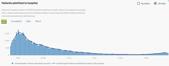
Many have responded by saying that it is daily COVID hospital admissions which is the key plot to focus on.  It is certainly a better indicator of the COVID trend than just 'cases' and it is all plotted daily at https://coronavirus.data.gov.uk/. Here is today's plot shown on the site:


However, even if we ignore the major problem with the data for Wales (which artificially inflates the admissions data), there is still a problem in using this plot to monitor the progress of COVID. To see why, here is what the website says about the England data:

"data include people admitted to hospital who tested positive for COVID-19 in the 14 days prior to admission, and those who tested positive in hospital after admission. Inpatients diagnosed with COVID-19 after admission are reported as being admitted on the day prior to their diagnosis"

In other words, we have no idea how many of the 'COVID hospital admissions' were people actually admitted because of COVID. A person entering hospital for, say, cancer treatment who recently tested positive for COVID will be officially classified as a COVID case. The same is true of those entering hospital for any treatment who have not previously been tested positive for COVID but 'test positive' at some time during their stay. We have to therefore assume that - as in the public generally - a proportion of the 'COVID hospital admissions' are people who either a) don't have COVID; or b) are asymptomatic (or who will only ever have mild symptoms). 

It also means that, as with 'COVID cases', much of the recent increase in 'COVID hospital admissions' may be explained by the general increase in number of people being tested. Unfortunately, we do not have the daily data for number of people being tested before and during UK hospital admissions. But it is not unreasonable to assume the number is roughly proportional to the total number of people being tested in the UK. So it makes sense to plot (using the data provided at https://coronavirus.data.gov.uk/) the daily hospital 'COVID admissions per 1000 people tested' in preference to simple the COVID admissions:

As data for number of people tested are only provided from 22 April, this plot does not cover the March period as in the plot above. However, you can see that the trend is similar except since 1 Sept, where the increase is more gradual. This suggest that, indeed some (but not all) of the recent increase is explained by the increase in testing.

Here is the same plot from 1 July:

And - before anybody suggests that it's "COVID deaths" not hospital admissions we should be looking at - everything I said above is also releant to those classified as COVID deaths.

See also: