Another Update 15 Dec: The curious case of the missing regional test data
Updated 14 December 2020
I wanted to see some data comparing people with COVID-19 symptoms to the 'case' numbers. The first link I found with relevant data was from Buckinghamshire, whose dashboard provides details of different types of triage numbers. As you can this provides yet more evidence of why counting 'cases' (without considering number
of people actually ill with the virus and number tested) is really dumb.

(while I was impressed with the Bukinghamshire dashboard I was surprised that it doesn't have data for numbers tested, which almost certainly have been steadily increasing as elsewhere).
After tweeting about that somebody pointed me to a national NHS dashboard for COVID-19 triage. And it turns out that the national figures also show the stark difference between number of 'cases' (high and increasing) and number of people actually ill with symptoms (consistently low since the usual September blip).

So the 'casedemic' argument grows ever stronger.
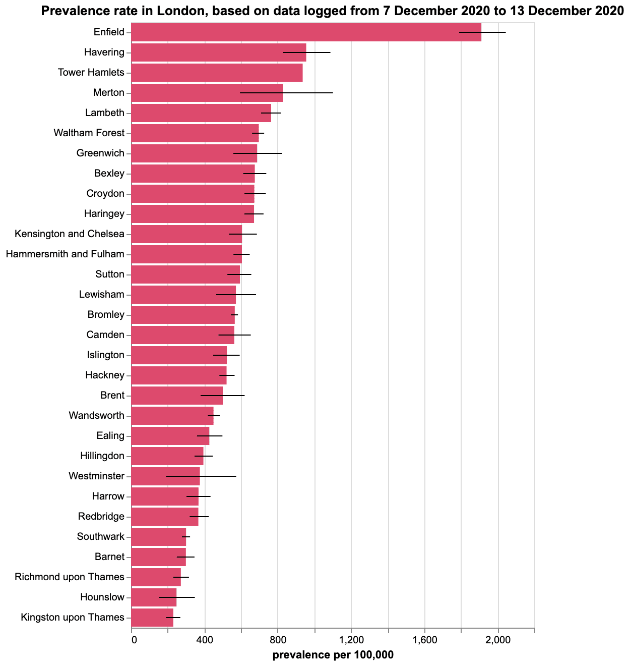
I was also interested to see Tim Spector's analysis of London prevalence rates based on his ZOE css app for monitoring people with symptoms. This confirms how ludicrous today's Government decision was to move the whole of London to Tier 3 lockdown (caveat: of course I don't belief there should be any lockdowns of any sort anywhere for the reasons given below).
Now on to my normal regular updated plots:
Using only the data from https://coronavirus.data.gov.uk/ today (but taking account of numbers tested) here is an update of the key trend plots (UPDATE: the website https://inproportion2.talkigy.com/dashboard/ provides similar information to what I show below)
First we have the new 'cases' (i.e. those testing positive) as a proportion of number of tests (this now includes lateral flow device tests as well as PCR tests):

So a very slight uptick in proportion of positive tests, but it is important to see this article for why there may be multiple explanations for such changes.
And here is the latest plot of 'cases' (i.e. positive tests) and number of tests (obviously different linear scales used for each as shown; moving 7-day averages with 2-day delay on cases):

Next, the proportion of 'cases' which lead to hospital admissions (but, as usual, note that any person admitted to hospital who has a positive PCR test within 14 days prior to admission or within 28 days after admission is classified as a COVID admission irrespective of their reason for being in hospital). And we know that many patients now classified as COVID admissions are people who actually 'contracted' COVID in hospital.


Note that none of the above plots are provided on the government website. The most relevant graph provided on the Government website is the number of 'COVID deaths', but (as with hospital admissions) we do not know how many of these are actual deaths because of COVID.

As usual all the caveats discussed previously apply. This includes the fact that the government data actually tells us very little about what we really need to know; for example, none of the above tell us what the real death rate or infection rate is - as explained in the following two graphics:

And of course the fact that we are still waiting for the evidence needed to determine whether the 'benefits' of lockdowns exceed the 'costs':

Finally here is a summary of the data/evidence we really need to determine if the 'benefits' of lockdowns exceed the 'costs':

Oh and here is an interesting comparison between the UK and Sweden which suggests lockdowns do not reduce deaths.

See also
- Different explanations for increasing number of proportion of positive test results
- Why we know so little about COVID19 from the data provided
- Impact of false positives in Covid testing
- Covid19 hospital admissions data: evidence of exponenial increase?
- Don't panic: limits to what we know about Covid-19 PC testing, inferred infection rates and alse positive rates
- A privacy-preserving Bayesian network model for personalised COVID19 risk assessment and contact tracing
Covid-19: Infection rates are higher, fatality rates lower than widely reported - Coronavirus: country comparisons are pointless unless we account for these biases in testing
- Why most studies into COVID19 risk factors may be producing flawed conclusions - and how to fix the problem
- Causal explanations, error rates, and human judgment biases missing from the COVID-19 narrative and statistics
- Covid-19 risk for the black and minority ethnic community: why reports are misleading and create unjustified fear and anxiety
- UK Covid19 death rates by religion: Jews by far the highest and atheists by far the lowest 'overall' - but what does it mean?
- All COVID articles on this blog
Excellent post. I used to be checking constantly this weblog and I am inspired! Very helpful info specially the closing part :) I maintain such info much. I used to be looking for this certain information for a long time. Thanks and best of luck.
ReplyDelete