Saturday, 27 February 2021

The Cambridge study testing asymptomatics and its implications for the claim that "1 in 3 people with the virus have no symptoms"

This makes interesting reading for anybody who still believes the Government 'case' data and the claim that just because you don't have any COVID-19 symptoms it doesn't mean you aren't in danger (and a danger to others)....

This data also means that if the Government claim that “1 in 3 people with the virus has no symptoms” is correct then the ONS estimated infection rate is massively inflated - the currently reported ‘case’ numbers must be at least 11 times greater than the true number of cases. On the other hand, if the Government estimates of case numbers are correct then at most 1 in 34 people with the virus has no symptoms.  Here's why:

Cambridge has a population of 129,000.

If the ONS infection estimates for Cambridge (0.71%) are accurate, then during an average week in this period about 916 people had the virus and 128,084 did not. 

But if the “1 in 3” claim is correct about 305 of the 916 people in Cambridge with the virus were asymptomatic and 611 had symptoms. 

While we do not know how many people in total in Cambridge were asymptomatic, we can certainly assume there must have been at most 128,389 (namely 129,000 minus the 611 we know had symptoms). So, with 305 asymptomatics having the virus, that means at least 305/128389 people with no symptoms had the virus. That is at least 0.24% (i.e. at least around 1 in 421). 

But the study shows on average only 1 in 4867 (0.0205%) asymptomatics had the virus. So, we should have found at most 26 asymptomatics with the virus not 305.

That means the “1 in 3” claim and the ONS estimates cannot both be correct. 

If the “1 in 3” claim is correct, then the maximum possible value for the infection rate is at most 0.062% and not 0.71% as claimed. So the ONS estimated infection rate would be 11 times greater than the true rate. (Formal proof below)

On the other hand, if the ONS reported infection of 0.71%  is correct, then at most 2.95% (1 in 34) of people with the virus have no symptoms and not 1 in 3 as claimed. (Formal proof below)


Conclusions:

  • Although the above analysis applied to a single UK city, there is no reason to believe it' is special (see the report below on national lateral flow testing data).   
  • Since mass PCR testing began many of those classified as 'cases' were not COVID-19. And the Government claim that "1 in 3 with the virus has no symptoms" is massively exaggerated.  There needs to be confirmatory testing for any people testing positive before they are declared a 'case'.
  • We should stop testing people without symptoms unless they have been in recent contact with a person confirmed as having the virus.
  • And it's always interesting to compare number of NHS 999 emergency COVID-19 calls/triages with number of 'cases'. This data (digital.nhs.uk/dashboards/nhs) clearly shows real pandemic last spring but not '2nd/3rd waves'. All caveats discussed here probabilityandlaw.blogspot.com/2021/01/more-o apply


Also: This Government report says 9,480 of 2,372,358 lateral flow tests in UK 28 Jan - 3 Feb were positive. It is assumed almost all lateral flow tests are on people without symptoms. Given the false positive rate for these tests that's about 1 in 1587 true positives. In the same period the ONS estimated UK infection rate was 1 in 77.  

Obviously all of this data is on asymptomatics tested, so we expect the percentage testing positive to be less than the overall infection rate. However, this data still massively contradicts Government claims about asymptomatics as explained here.

And, of course, we have very solid evidence that the number of 'cases' based on PCR testing are inflated.

The links: 


Wednesday, 24 February 2021

COVID-19 risk to Jews

From last year's ONS report. These figures are before adjusting for age and multiple other factors


The increased risk of COVID-19 to the BAME community has been very widely discussed. There are doubts about the extent to which socio-economic factors, rather than genetic factors, explain the increased death risk and - as we pointed out in this article - there are also doubts about the way the risk is analysed and presented which can lead to exaggerations.  

Much less discussed is the increased risk to the Jewish community. In July we noted that the ONS report on COVID-19 risk by religion highlighted the increased risk to Muslims, even though the data suggested that Jews were the religious group with the highest risk of death. A new study provides further evidence that it is, indeed, Jews who have the highest risk of death from COVID-19.

 The study by Gaughan et al concludes

The majority of the variation in COVID-19 mortality risk was explained by controlling for sociodemographic and geographic determinants; however, those of Jewish affiliation remained at a higher risk of death compared with all other groups. 

Another study by Gaskell et al focuses on the orthodox Jewish community and confirms that there is an especially high prevelance of COVID-19 among this community. 

Thanks to Dr Robin Goodwin for alerting me to the new publications. 

Full details:


Wednesday, 10 February 2021

Claim that "1 in 3 people who have the virus have no symptoms" is a misleading exaggeration


28 Feb 2021  DRAFT ONLY: This article is under review and will be updated. An updated analysis with new data from the Cambridge study is here

One of the major messages currently being pushed everywhere by the UK Government about COVID-19 is the claim that "1 in 3 people who have the virus have no symptoms". 

A person is classified as having COVID if they get a positive test result and it has long been conjectured that (for PCR tests) many of these are false positives especially for people who have no symptoms and where there was no confirmatory test (the new evidence below provides further confirmation of this). So, clearly, it is possible that a large proportion of people classified as having the virus (as opposed to actually having the virus) have no symptoms. But, the new evidence suggests that either the "1 in 3" proportion is massively exaggerated, or the 'case' numbers are massively exaggerated. Or (likely) a combination of both. They certainly cannot both be true. In fact, if we accept that the Government case numbers really are people who have the virus then (based on the new evidence) it turns out that between 1 in 56 and 1 in 13 people who have the virus have no symptoms - very different from the Government "1 in 3" claim. Conversely, if the "1 in 3 claim" was really correct, than it turns out that the proportion of people with the virus during 1-7 Feb was not 1.25%, i.e. 1 in 80 as claimed, but between 0.09% and and 0.29% (i.e. between  1 in 1,111 and 1 in 345).

To understand what it going on here, it is important first to note that many people who see a statement like 

"1 in 3 people who have the virus have no symptoms" 

assume this is the same as:

"1 in 3 people who have no symptoms have the virus". 

That is, in fact, a classic  probability fallacy called the fallacy of the transposed conditional (or prosecutor's fallacy) whereby the probability of a hypothesis H given some evidence E is assumed to be equal to the probability of  the evidence E given  the hypothesis H. It is not. Just think of the example where an animal is hidden behind a screen. Let H be the hypothesis that the animal is a cow. We know that almost every cow has 4 legs (we allow for a few who have lost legs). So if I give you the evidence E that the cow has 4 legs then the probability of the evidence E given H is 1 (or very close to it). But the probability of H given E (i.e. the probability the animal is a cow given that the animal has 4 legs) is certaintly not close to 1 since most 4-legged animals are not cows. 

Perhaps the Government "1 in 3" message was phrased in the way it was to deliberately exploit this very common misunderstanding.  Obviously, it is not the case that "1 in 3 people who have no symptoms have the virus", because even if as few as a half the UK population does NOT currently have COVID-symptoms, then there would be over 11 million people who have the virus but no symptoms. This is clearly wrong, since the ONS estimate for total active cases for the week ending 6 Feb is that less than one million people (1.25% of the population) have the virus (in any case, as we explain below, we believe the 1.25% is too high anyway because of the inclusion of false positives).

The new evidence that suggests that both the case numbers, and the claim that "1 in 3 people who have the virus have no symptoms", are exaggerated comes from an ongoing study at Cambridge University. This study tests students without symptoms and, for the week of 1-7 Feb, they reported that a total of 4058 students with no symptoms were tested. None of these students were confirmed as positive, although critically (as we discuss below) there were a significant number of false positives.

Here is a screenshot of the summary results:

Can we conclude that the true percentage of asymptomatic people with the virus (in the week 1-7 Feb) is 0%.  No, because this is only one sample from a large population. If we use all the recent Cambridge data (6 cases from 11,573 people with no symptoms) then we could assume that about 0.052% of people with no symptoms have the virus. However, that data was for different weeks and it is not clear how many of the same students were tested. Fortunately, there is another relevant publicly available dataset for the week of 1-7 Feb that we can use - the data on Premiership football players and staff  where we find that only 2 out of 2970 tested positive. Unlike the Cambridge study we cannot be certain that all of the 2970 players and staff tested during the week of 1-7 Feb had no symptoms. Given that footballers are among the few in the population not subject to social distancing it could be argued that (except for people in care homes and hospitals) we ought to see a higher infection rate among them compared to most of the population. If the ONS estimate of 1.25% of the population having the virus during the week of 1-7 Feb were accurate then we might expect to have found 37 cases rather than 2.  It is conservative to assume that most of the 2970 did not have symptoms. We do not know if either of the 2 positive cases had symptoms. If they did  then (together with the Cambridge study) we could conclude that, of over 7000 people with no symptoms not a single one tested positive. So, let us conservatively assume that the 2 positive cases did not have symptoms. Then, combining the Cambridge and Premier League data we have 2 ‘cases’ from 7,028 people with no symptoms, i.e. 0.0285% of those with no symptoms has the virus.

The two samples are, of course, not representative of the population. However, this sample bias should surely favour the Government claim, because if any group are really likely to have COVID-19 but no symptoms it is surely young and fit people.   

What these two samples provide is an estimate of the probability a person has the virus given that they have no symptoms. Using the Government claim of 1.25% probability a person has the virus we can use Bayes Theorem to provide an estimate of the probability a person has no symptoms if they have the virus - which the Government claims is 33% (that's the "1 in 3 claim"). The (Bayesian) 95% confidence interval estimates this probability to be between 1.8% and 7.8% with a mean value of 4.7%. So, instead of 1 in 3 as claimed the figure is between 1 in 56 and 1 in 13, with 'expected value' 1 in 21.

On the other hand if we use the Government "1 in 3" claim, we can also uses Bayes Theorem to estimate the probability a person has the virus. The (Bayesian) 95% confidence interval estimates this probability to be between 0.09% and 0.29% with a mean value of 0.2%, which would suggest the claimed 1.25% infection rate is exaggerated by a factor of over 6.

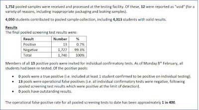
The critical additional information in the Cambridge report is the evidence it provides about false positive tests for people without symptoms as seen in this screenshot:


Critically, the study does pooled testing and then confirmatory testing on each individual case if a pooled test is positive. In the study there were 1752 pooled samples of which 13 were false positives (in the sense that when individual confirmatory testing was done on these, every sample in all 13 pooled samples was negative).  So, even in the highly skilled testing environment at Cambridge, the false positive rate (without confirmatory testing) for people without symptoms during the week of 1-7 Feb is 0.7%. This is a much higher rate than the 1 in 400 (0.025%) reported 'to date', but it should be noted that the 1 in 400 rate was also reported for the previous week so it clearly does not take account of the large number of false positives during 1-7 Feb. It is also not clear if the 1 in 400 rate includes confirmatory testing.

The Government 'case' numbers are based on mass PCR testing and there is no evidence that any confirmatory testing has been undertaken as previously reported on this blog. The mass PCR testing will certainly have a higher false positive rate for people with no symptoms than that at Cambridge.  This is very important for understanding why the Government 'case' numbers - as well as the "1 in 3" claim are exaggerated. Based on the Cambridge data and some other reasonable assumptions it follows that a high percentage of those without symptoms testing positive are false positives (the report will provide the full Bayesian analysis).


See also:  

NFL: All 77 NFL positive covid-19 tests were false positives

Lions' Matthew Stafford glad false-positive led to covid-19 testing change

 All COVID-19 articles on this blog


Thursday, 4 February 2021

What can we learn from very few data points (with implications for excess death numbers)?

Let's suppose that a museum decides to spend money in Sept 2020 advertising for new members. To see if the advert has worked you manage to find the data for numbers of new members (adjusted for changing population size) in October in each of the 5 previous years. The numbers are:

  • Oct 2015: 176
  • Oct 2016: 195
  • Oct 2017: 169
  • Oct 2018: 178
  • Oct 2019: 162

Suppose that, in Oct 2020, we see 178 new members. This is above the preceding 5-year average of 176, but we actually saw higher numbers in two of the five previous years. So, nobody would seriously suggest that the 'above average' number of new members was due to the advertising. But what if we saw 197 new members? Or 200, 210, 220, 250?  At what point could we reasonably conclude that the number is sufficiently 'higher' for there to have to be some causal explanation such as the advertising or some other factor?

The classical statistical aproach to answering this question is to 'fit' the data to a statistical distribution, such as a Poisson or Normal distribution. This enables us to determine the range within which we would 'expect' a new number to fall if there had been no intervention. The Poisson distribution 'fit' for the 5 years is:

Note: the Poisson distribution has just one parameter, namely the mean which is 176 in this case; the variance is the same as the mean

So, if we set the threshold at 95%, and observed say 200 new members, we might conclude - as evidence to support the impact of the advertising - that:

"The number of new members significantly exceeds the 5-year average (95% confidence bound)."

(The best fit Normal distribution has mean 176 and variance 152.5 so is 'narrower' than the Poisson above, with slightly lower percentiles, namely 196 and 204 for the 9% and 99% respectively, so if we felt that was a more reasonable model, we would conclude that a value of 197 was above the 95% confidence bound for the 5-year average).

But, even with the tiny sample of 5 data points we have one datapoint of 195 (in Oct 2016) which is very close to being beyond the 5-year upper 95% confidence bound. So why should we consider 200 especially high? 

Indeed, if we had data for more than 5 previous years of October new members, we might discover that every 10 years or so there is an October surge due to things that have nothing to do with advertising; maybe, there are major school initiatives every so often, or a local TV station runs a story about the museum etc. Perhaps in Oct 1998 there were 2000 new members in October which is assumed to have been due to a Hollywood movie having a set filmed there then. So, assuming it was available and adjusted for population size, how far back should we go with the data?

If we really must rely on such tiny datasets for making the kind of inferences here, then simply 'fitting' the tiny dataset to a particular distribution does not capture the full uncertainty we have about new member numbers. Fortunately, the Bayesian approach to learning from data enables us to accommodate this type of uncertainty along with any prior knowledge we have (although in this case we do not include any explicit prior knowledge). The Bayesian model* (see below for details) produces quite different results to the standard distribution fitting models. The 95% and 99% upper confidence bounds turn out to be 205 and 227 respectively. In other words, if there were say 204 new members in October 2020 then we would not be able to reasonably claim that this exceeded the 5-year average upper 95% confidence bound. 

It is also important to note that, using just 5 data points also make the results extremely sensitive to small changes. Suppose, for example, that the 2019 was not 162 but was 120 (with all other numbers exactly the same). Then, although this makes the 5-year average much lower (it drops to 166) the (Bayesian learnt) distribution becomes 'wider' (i.e. the variance inceases) so that the 95% and 99% upper confidence bounds turn out to be much higher at 236 and 294 respectively.

You may be wondering why these differences are important. It is because the number of 'excess deaths' is now widely used as the most important indicator of the impact of  COVID and/or lockdowns. And one of the standard approaches for determining whether increased death counts are likely explained by COVID and/or lockdowns is to use the previous 5-year datasets of death numbers and the model 'fitting' approach described above.

Indeed this issue - and the limitations of using such 5-year averages - is the subject of this very interesting analysis "Home Depot, Hogwarts, and Excess Deaths at the CDC"  by Kurt Schulzke. 

In fact, the 2015-2019 numbers used in the hypothetical museum example above are exactly the week 15 numbers for fatalities per million of the population for the state of Nebraska.

Based on the CDC approach (which uses the Poisson distribution) if the week 15 number had been above 198 it would have been classified as beyond the 5-year average upper 95% confidence bound. But a number above 205 would have been required for the more realistic Bayesian approach. The actual number was 178 - which could still be reported as being 'above the 5-year average' but is, of course, not at all unusual.

So what this all means is that you need to be very wary if you see conclusions about the current week, month or year death numbers being 'significantly above the 5-year average'. 

Here are the details for those interested in the Bayesian learning models (you can run these models, including with different values using the free trial version of AgenaRisk (www.agenarisk.com); the model you need is here (right click and 'save as' to save this as a file which you then open in AgenaRisk)


*As you can see from above we considered two different Bayesian models, one based on the Normal distribution and the other based on the Poisson. The problem with the Poisson distribution is that it is most suited to those situations where we are measuring the number of occurences of fairly rare events in a given period, so that the number are typically very low (like number of buses arriving at a stop every 10 minutes). Also, its assumption of a constant mean rate equal to the variance is intrinsically contradicted by death data. Even before COVID19, different types and severity of flu at different times of the year (from one year to the next) causes significant fluctuations which, over a long period, cannot be 'fitted' well to the 'narrow' Poisson distribution. Hence, the Normal distribution - whose variance is independent of the mean and which can be 'learnt' from the data - is more suitable. However, even the Normal will generally be too 'thin tailed' to properly model unusual and rare deviations which might be expected with death data.

See: "Home Depot, Hogwarts, and Excess Deaths at the CDC"  by Kurt Schulzke.


Wednesday, 3 February 2021

The curious change in relationship between 999 COVID calls and COVID deaths


I have previously reported on the strange discrepancy between COVID 'cases' and COVID-related 999 calls/triages

With the massive January 2021 surge in COVID classified deaths I've been looking at the relationship between death counts (reported at https://coronavirus.data.gov.uk) and the 999 triages and calls (reported at https://digital.nhs.uk/dashboards/nhs-pathways

The problem with the 999 data is that for many regions (including London) it does not include all 999 ambulance service calls related to COVID. But, for certain areas such as the West Midlands, the 999 calls data does include the 999 ambulance service calls*. So using the filtering option to display only the plot of 999 calls for the West Midlands NHS authorities, it is possible to do a complete comparison to deaths in the same area as shown in the diagram above. 

I welcome any explanation for why the daily ratio between 999 COVID calls and deaths was consistently about 3 to 1 during 2020, but suddenly became 1:1 from the beginning of 2021.


*It is, however, important to note that the national pattern for both 999 calls and triages (including areas like London that do not include ambulance data) is actually almost identical in shape. The national deaths plot trend is also almost identical in shape as can be seen here:


As usual all the usual caveats discussed here apply.